Redesigning YouTube
2014/03/24.
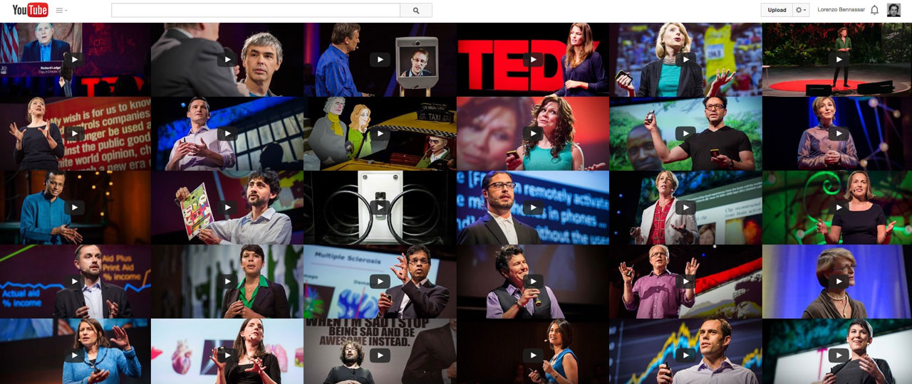
It’s been a while since I think YouTube is definitely the best social online video experience, mostly because of the technology behind: best loading, almost no playing breaks, etc. But it’s been that same while since I think it could definitely use some design improvement. And it was just the other day when I came across what it could look like. It happened visiting a big Brazilian corporation when I suddenly found myself in front of one of those live broadcast control rooms with a mosaic of 36 screens. Then I thought how great it would be to have a big (endless) mosaic with all the video previews. Just the same way Google shows the results when you look for images. That’s what I think YouTube should do when you look for videos. Clean previews, with a layer showing the video details when you go over with your mouse and an endless scroll to get people hypnotized by the incredible amount of content you can find inside.
I don’t know much about writing html, and I know even less about programing, writing code, script or optimizing video, but I couldn’t help giving it a try to see what it would look like:
youtube.lorenzobennassar.com
(sorry for the slow loading process but you get the idea, don’t you?)
Rediseñando YouTube
Hace ya tiempo que pienso que YouTube es la mejor experiencia de video social online. Principalmente por la tecnología que hay detrás: la mejor carga de video, casi sin interrupciones en la reproducción, etc. Pero hace también ya tiempo que pienso que no le vendría mal un lavadito de cara. Y fue justo el otro día cuando me encontré de frente con el aspecto que podría tener. Estaba en una gran corporación brasileña cuando de repente vi una de esas salas de control de emisión de video en directo con 36 pantallas de plasma en la pared. Y pensé en lo bien que estaría tener un mosaico sin fin de los previos de los videos. Exactamente igual que Google te enseña los resultados cuando buscas imágenes. Eso es lo que creo que debería entregar YouTube cuando buscas videos. Una cuadricula limpia de previos, con una capa para mostrar los detalles del video (cuando pasas el raton por encima) y un scroll infinito para quedarte hipnotizado por la inmensa cantidad de contenido que puedes encontrar (por supuesto, habría que pensar un poco mas algunos detalles como smartphones, tablets y publicidad).
No se mucho de html y se todavía menos de programación, código, scripts y optimización de video, pero no pude evitar hacer un boceto para ver que aspecto tendría:
youtube.lorenzobennassar.com
(siento la lentitud en el proceso de carga pero sirve para hacerse una idea no?)
And it seems I’m not too far away from what others might think:
Bing video search:
http://binged.it/1hoyHu8
NBC News video search:
http://nbcnews.to/1hoyU0d