A new interaction with logos. And brands.
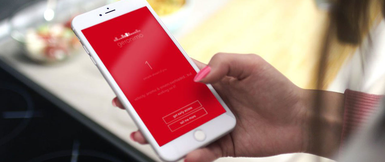
Today I downloaded a new email app for the iPhone. Geronimo. Although it’s still having some development issues, it looks really interesting. Specially because it takes advantage of the iphone accelorometer so you can really benefit from gesture to go through the normally tedious mail experience.
But from the brand communication and branding prespective, what really got my attention is how the logo moves with your gestures. You can literally interact with the logo by simply tilting your phone. Notice the movement on the “chart looking bars” of the logo in the video above. It’s kind of like an hologram. Not a static, unanimated representation of a brand, but an image that reacts to you. An “accelerometer logo” version.
And that brings a whole new dimension to logo design. It’s not what we were use to with motion graphics. It’s more like interaction graphics. A simple (for now) but nice way for people to interact with the logo, and therefore with the brand. Because today, with so many screens surrounding us, when everyone walks around with a device that reacts to you in many ways, a logo should certainly not just be a static representation of a brand´s image but follow us wherever we go, moving at the same pace we do. At least, that’s what I would like if I was a brand aiming to live in your pocket, to being so often in your hand and sleeping next to you in your bedside table.
Una nueva interacción con los logos. Y las marcas.
Hoy me he descargado una nueva app de correo para el iPhone. Geronimo. Y aunque aún tiene algunos problemas de desarrollo, tiene muy buena pinta especialmente porque aprovecha las ventajas del “accelorometer” para mejorar la normalmente tediosa experiencia de mirar tu correo.
Pero desde el punto de vista de la comunicación de marca y el diseño de identidad corporativa, lo que realmente me ha llamado la atención es como el logo se mueve con el iPhone. Puedes literalmente interactuar con el logo simplemente girando el teléfono. En el vídeo puedes ver como se mueve el “gráfico de barras” que compone el logo. Es como una especie de holograma. No una estática e inanimada representación de la marca, sino una imagen que reacciona a tus movimientos. Una versión “accelerometer” del logo.
Y eso aporta toda una nueva dimensión al diseño de logotipos. No es exactamente a lo que estábamos acostumbrados con los “motion graphics”. Son mas bien gráficos interactivos. Una sencilla (de momento) pero interesante forma de interacción entre las personas y el logo, y por tanto la marca. Porque hoy, con tantas pantallas alrededor, cuando todos andamos por la vida con un dispositivo que reacciona con nosotros de tantas maneras, un logo no debería sin duda ser una estática representación de la imagen de una marca, sino seguirnos allá donde vayamos, moviéndose a nuestro ritmo. Al menos eso es lo que yo querría si fuese una marca que quiere vivir en tu bolsillo, estar tan a menudo en tus manos y dormir junto a ti sobre tu mesilla de noche.
Interesante reflexión A new interaction with logos and brands #Branding #Diseño via @bennassar http://t.co/xxI3nE2HRi